New cover artwork for US editions


Posted by Jason  on Jan 25 2012 05:30 PM under in Books and eBooks
For the first time since their original publication, the first three Wheel of Time novels will be published with new artwork on the covers.

Tor Books announced today via Tor.com that The Eye of the World, The Great Hunt, and The Dragon Reborn will be re-released in trade paperback form with new cover designs.

From Tor.com:
As Harriet MacDougal and Brandon Sanderson work to complete A Memory of Light, the final volume in the series, the timing is perfect for millions of Wheel of Time fans to go back to the very beginning, when five kids from Emond’s Field had little idea of what lay ahead. Whether you’ve read the series once, a dozen times, lapsed after book eight, or are just coming to it fresh for the first time, these new editions are a perfect jumping off point for a fresh readthrough.


The new editions will be released this summer, beginning with The Eye of the World in May, followed by The Great Hunt and The Dragon Reborn in June and July, respectively.

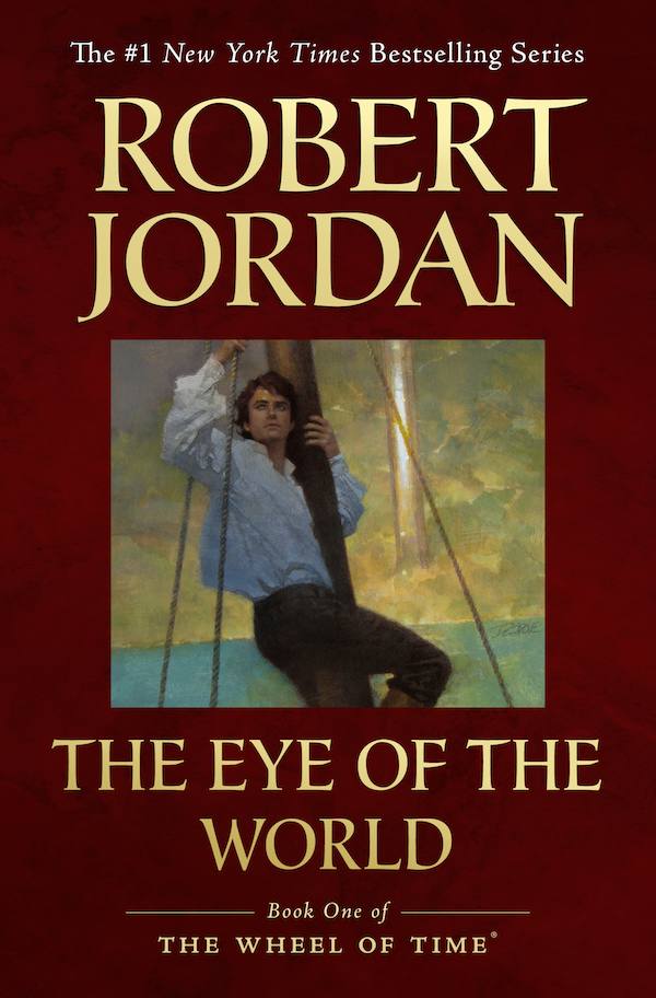
Each cover features artwork originally introduced for the eBook editions. Check our eBook Gallery for the complete set of covers.

So, what do you think? Will you pick up these fresh copies for your latest re-read? They make great gifts for friends who would appreciate a good story and compelling modern book covers.
The Eye of the World

The Great Hunt

The Dragon Reborn
  • You cannot edit this news item
Share this article:
*****
Rate this article:
Posted by Jason  on Jan 25 2012 05:30 PM under in Books and eBooks

32 Comments

  • 2 Pages +
  • 1
  • 2

tnsabregirl 

25 January 2012 - 10:10 AM
Wow! that is cool news!

Escalus Drax 

25 January 2012 - 11:08 AM
I love the cover for The Great Hunt. Absolutely superb!

BlackAjah 

25 January 2012 - 11:16 AM
I already posted a comment here but somehow it got deleted or didn't properly post so I'll write it again, but, I agree with many of the comments on Tor.com, that this is a bit of a lackluster event considering it's the Year of the Dragon and all. It seems like Tor is putting small thumbnails on paperbacks and asking us to shell out more money, and just for the first 3? There is no word if they are rereleasing all of the books in paperback with the amazing eBook covers. I remember tons of people at Tor.com saying they would shell out their money for an eBook cover art calendar or dustjackets. If we had a calendar then we would be able to see the details of the artwork much better. Why does there have to be such a vast border around the small thumbnail pictures? The art should take up the whole cover. I really wish Irene at Tor would tweet me back, she never does, but I am curious about Tor's decision regarding the DKS cover for AMOL. Now THAT would be some real news. Fans already have to deal with now waiting until perhaps NOVEMBER for the final book when we've waited long enough (20+ years!) just because it makes more marketing sense to Tor? Tor could definitely get us the book, which is completed, by summer. I don't mean to complain, but when I saw this news about new covers, I jumped out of my seat with excitement and then when I saw the covers I was very underwhelmed. Tor should be providing us with some real perks as we approach the end, not books we already have multiple copies of with small thumbnail eBook artwork. Just sayin...oh btw, thanks for the cool newsletter, Dragonmount, and for all off your hard work in all things WOT.

Testy al'Carr 

25 January 2012 - 11:23 AM
have to say, like "black ajah" i am very underwhelmed by these covers.

mjclevenger 

25 January 2012 - 11:57 AM
I wish they were hardcover editions available with the new covers. I don't think I would purchase paperbacks to re-read.

Nynaeve452 

25 January 2012 - 12:07 PM
My apologies, but I must say I too am not overly impressed with these new covers. The hardback limited edition was far prettier. A shame as there is so much superior Wheel of Time art out there. What were they thinking?.

Jason 

25 January 2012 - 01:13 PM
Hi BlackAjah ... thanks for your comments. I don't know for certain, but I suspect that Tor had the following thoughts:

1. DKS has passed away and his in-progress book cover cannot be used. What do we do?
2. Answer: Let's make fresh covers
3. But a new cove won't match the old ones
4. So let's make new covers
5. But we don't have time (or budget) to make 13 new paitnings
6. LEt's use the overall excellent eBook covers

People have complained that the covers dont' feature the ENTIRE art. Well, that may be true, but overall those covers represent a very modern look for trade paperbacks. In fact, one of the complaints about the original covers is that they scream "GEEK FANTASY!" rather than "Mainstream epic saga". These new covers are far more likely IMO to be interesting to a casual reader or somebody who has not heard of WoT.

Frankincell 

25 January 2012 - 02:07 PM
@Jason,
I don't know the legal ins-and-outs of publishing, but I would think that the unfinished art for the last book would be very appropriate. Darrell passed away before he could finish the last painting, Robert passed away before finishing the last book. It would be visual representation of how incredibly important the final book is. Let the final book have the final artwork.

"The author and the painter passed on before this was published, but it was finished and released to millions of adoring fans."

By the way. I think that Brandon is doing an incredible job of finishing the book. He really knows his craft.

P.S. I greatly respect James Rigney and do not intend ANY disrespect toward him or Darrell. "Kiserai ti Wansho" Glory to the builders.

phoenixtrinity 

25 January 2012 - 02:10 PM
Wow, these covers look awesome. I may have to pick up the new copies just for the sake of having different covers to add to my collection!

Pd6Meunz6ELXEw 

25 January 2012 - 02:44 PM
They'd do better to make them look exactly like the covers in the ebook gallery; i.e. don't put a thick border around the picture. I admit the color scheme and lettering looks pretty attractive, but the cropped pics just look like an afterthought.

Shawnchan 

25 January 2012 - 02:56 PM
For me the cover for TEOTW would turn me off on purchasing it, especially if I was a first timer.

It looks like a Pirate novel.

ashaman73 

25 January 2012 - 04:34 PM
This news about the new book covers is slightly interesting and I imagine there will be a few people that will buy them. I agree with a prior comment when I say that I hope tor will stick to the artwork and outline, etc. left by DKS for traditions sake for the next book AMOL! Going back to the new book covers I think it would be kind of cool if tor released TWOT books 4-14? in trade papebacks like they did for TWOT books 1-3. Wishing everone the best! Thanks for the update dragonmount!

Rachel Rahien 

26 January 2012 - 12:39 AM
I'm hoping Orbit also releases similar covers...probably not though *sigh*

Alric 

26 January 2012 - 01:45 AM
Indeed the new covers might be better suited to new readers, and I prefer them myself, but why only show a small square of them? The border/frame is ridiculous. I really, really hope Tor reconsiders and use more of the art instead of cropping it horribly.

Orderofolde 

26 January 2012 - 02:09 AM
I agree that Eye of the World looks like some old sailing novel, Rand in the rigging is not the best image for TEOTW, however I like The Great Hunt cover, but lots of disappointment. Very underwhelmed and surprised at finding myself posting it, it's disappointing.

trench 

26 January 2012 - 04:19 AM
Well I have been dieing for new wot covers for a long time now. So on that note, yay! But the art for TEOTW is the most under whelming of all the ebook covers, and now that the art is just a thumbnail. If tor wants to release all of the books again that's fine, but they dropped the ball here IMO, for some of the ebook covers this layout will work fine (tDR for example) but it wont work for some of the other one's (LoC). Also why only release the first 3, in the summer, tor should be releasing all of these books in a span of a couple months. Year of the Dragon my but, more like Year of the underwhelming ad campaign.

wottom 

26 January 2012 - 10:05 AM
Like many others I am underwhelmed. TEOTW and sailing rigging? Really? So much happens laying the foundations and tone so why a ship in a river? TGH is much better and conveys menace. DR... hmm not much to inspire so no rush to buy paperbacks. Prefer the well thumbed originals.

robchristianson 

26 January 2012 - 10:25 AM
Seems my response vanished....

I was saying, overall I am very impressed. As a graphic designer, I love the typography, layout, the way the artwork is used but compliments the cover, and the colors are great too. I think this is great.

Maybe the back will show a larger view of the artwork, across the top maybe? Too bad we didn't get a sneak peek at the spine and back cover.

I must say, I always thought the eBook art for tEotW was kind of misleading. Looks like a swashbuckling pirate book, like Peter and the Starcatchers... I would have picked a more classic scene... Trollocs bursting thru the door on Winternight? The empty road and black rider... Maybe even a scene in Shadar Logoth with Mordeth, Perrin, Rand and Mat. Or Rand's first time channeling to the rescue when he and Mat were trapped in that room in Four Kings and the lightnings came.

Crowl Rife 

26 January 2012 - 03:46 PM
I'm not going to buy these since I've already bought the books 3 times already, and am quite content with just the hardback and Kindle versions, but they look a millions times better than the Sweet covers. They look a lot more professional. It is too bad they are only for trade paperbacks, though... I think these would look better on mass market paperbacks. The series is well-established already and there are plenty of places on the internet for people to learn about them, I really don't think that at this point these covers would turn that many people off from starting on the series.

Shawnchan 

26 January 2012 - 08:36 PM
My other responses got deleted. Shrug?

jenniferl 

27 January 2012 - 07:58 AM
I'm not sure why comments are being deleted. I don't see anything in the moderation log, so it's got to be a bug n the site.

Ryrin 

27 January 2012 - 05:48 PM
I like them. I was not into fantasy at all....this would have attracted to me to the series.

Pawan 

27 January 2012 - 06:14 PM
If you go to tor website you will be able to see the full collection and even story around the development and why each cover art was chosen for each book.
Personally I love the cover of the Towers of Midnight which depicts Perrin after he has finished forging the power wrought hammer.

Shawnchan 

27 January 2012 - 11:58 PM
I said that the cover looked like a pirate adventure; in great detail.

It got deleted.

Probably not a glitch.

Probably censorship.

RyanG 

28 January 2012 - 10:06 PM
I was recommended the Wheel of Time series by a friend, having bought them without even looking at the cover, I can't say I wouldn't have bought them..

I will however say that I'm going to be buying the all the books in the series before they change them all. The books won't be the same with the new covers, just can't bring myself to accept them :tongue:

Dwynwen 

29 January 2012 - 02:24 PM
Shawnchan, I can assure you that Jenn was being honest when she said the moderation log showed nothing. Had you said something inappropriate, we would have given an explanation along with a deletion or edit. We understand that not everyone is going to have the same opinion of the covers.

wottom 

30 January 2012 - 08:20 AM
Just been pwerusing my paperback originals (uk editions of course) TEOTW is superb and gets into the feel of WOT. ACOS conveys something of the darkness besetting Rand. POD is just good artwork for an army on the March. The rest are pretty pedestrian and in the uk even the hardbacks stopped having artwork from book 10 onwards. So maybe I was being a bit mean when I said I was underwhelmed with the new artwork.
However, this was an opportunity to go for gold and I think we may be lucky to get bronze.
If only they were of the qualty of TGH. The trollocs for the first time look guenuinely scary and would certainly send shivers up and down my spine. Let's hope that someone gets a Myrrdrahl to have the same effect!!
what is your fav jacket folks?

wottom 

30 January 2012 - 10:54 AM
for clarity I meant a picture of myrrdrahl

Captain Jani 

02 February 2012 - 07:53 AM
I love the new covers! They look beautiful. Such an improvement over the previous artwork! I know that the guy who did the old covers wouldn't be pleased to hear it, but different projects require different collaborators. The guy who did the old covers also did the covers for Piers Anthony's Xanth series; in that case, the artist's style was a perfect match for the overall tone of the series (humorous and often silly).

I think the new covers have a well balanced design in terms of border, font style and size, artwork and background. They are elegant. Well done to the designer and artist.

.

Captain Jani 

02 February 2012 - 07:56 AM
Oh, and I think a calendar with larger prints of the paintings is a great idea! I'd buy one.
  • 2 Pages +
  • 1
  • 2


Want to leave a comment? Please Sign In or Register!

Sign In   Register   Help